Introduction
Correlation is not causation but it sure is a hint. – Edward Tufte
Determining causality is key to good decision-making. It shows up in nearly every business question, often as a way to estimate profit in different counterfactual scenarios. Without causality, everything feels like fate or random chance. We might have gut instincts, but we wouldn’t really know what causes certain outcomes.
Determining causality is why we run experiments, but what happens when we cannot run an A/B test (also known as a Randomized Controlled Trial or RCT)? What other options do we have? This is the question causal inference is designed to answer more fundamentally, and the focus of this blog post.
See my blog post overview on experimentation as somewhat of a precursor.
Causal Inference Overview
At the core of causal inference lies a simple but profound problem: we can never observe both potential outcomes (treated and untreated) for the same unit. As an example, what would have happened to this 40-year-old person had they attended college? We can never really know, so we approximate the answer by estimating the impact of the treatment (e.g. attending college).
The Average Treatment Effect (ATE) is the most common way to summarize a causal effect. It tells us the average impact a treatment would have if everyone got it versus if no one did: E[Y(1)−Y(0)], where Y(1) is the potential outcome if treated and Y(0) if not treated. For each individual, we only observe one of these, never both, depending on whether they received the treatment (T, where T=1 if treated and 0 if not). But ATE is just one way to look at effects. We might also care about the effect just on those who got the treatment, i.e. Average Treatment Effect on the Treated (ATT): E[Y(1)−Y(0)|T=1]. Or we might care about the group where there’s treatment was uncertain and people could plausibly go either way, known as the Average Treatment Effect for Overlap (ATO). The big question here is often to which group the estimated effect generalizes to.
The Neyman-Rubin potential outcomes framework treats causality as a missing data problem: we lack the counterfactual. So we try to impute that missing data using thoughtful assumptions and robust designs.
The gold standard of causal inference is a randomized controlled trial (RCT), where we assign groups randomly. If randomization is done properly, then the ONLY difference between the two groups is the treatment, meaning that any differences in outcomes must be BECAUSE of the treatment. Most of the bias is removed because each unit has an equal chance of being in either group. Without randomization, we rely on observational data (i.e. data not generated from an experiment), which can often give biased estimators. There is some risk with RCTs of not generalizing properly, but they require the fewest assumptions to yield unbiased ATE estimates.
Let’s now look at situations where we can’t experiment to better understand when causal inference methods are most useful.
When Randomized Experiments Aren’t Possible
There are many situations where we can’t run experiments – like mergers and acquisitions, policy changes, medical treatments, or Superbowl ads. The techniques used to evaluate these types of counterfactual scenarios are rigorous and persuasive, and we can apply them to business scenarios as well. In a tech product setting, we might not be able to experiment due to:
- Platform constraints (e.g. a new app launch or major redesign without a hold out group, or an infrastructure change where it’s unethical to keep some users on the old system).
- Regulatory or data privacy constraints (e.g. Fintech regulations prohibit random loan approvals or tracking users without consent).
- Business or organizational constraints (e.g. pricing changes – if customers notice they’re paying more than others, it can create reputational or legal risk. B2B clients may have contracts that prevent being randomly tested on).
- Temporal constraints (e.g. outcomes like retention/churn or LTV may take years to measure, which is often impractical).
- Interference / Spillover (e.g. Superbowl ads or social referrals where treatment and control users can influence each other). This violates the Stable Unit Treatment Value Assumption (SUTVA), which assumes that one unit’s outcome is unaffected by another’s treatment status. When spillovers exist, standard A/B testing may misestimate the true effect.
- Other considerations: Network effects and group dynamics. In some settings, especially social or marketplace products, value increased with adoption (e.g. ride-sharing). This means the effect of a treatment may depend on how others adopt it. While cluster or geo experiment designs can help reduce bias, they often oversimplify. Properly modeling these effects mau require representing and simulating the underlying network structure, which is often complex.
Ultimately, there are situations where we can’t run a true A/B test, but we still want to understand treatment effects using observational data. Sometimes we’re limited to retrospective analysis of treatments that have already occured. Simply comparing outcomes between treated and untreated groups does not reveal causal effects due to bias (differences between groups that aren’t caused by the treatment itself). This is where the causal hierarchy helps clarify what’s possible and what assumptions are needed. Causal inference guides us in identifying and addressing these sources of bias to distinguish true cause-and-effect relationships from mere associations.
Key types of bias from observational data include:
- Confounding bias: A third variable influences both treatment and outcome (e.g. lighters are correlated with cancer, but the real cause is smoking). Failing to account for confounders leads to false associations. This is conceptually similar to Omitted Variable Bias (OVB) in regression (excluding a variable that is correlated with both treatment and control and can bias our estimates).

- Selection or participation bias: We only observe outcomes from a non-representative sample (e.g. ex-customers citing price as their reason for leaving when it’s likely they only responded to the survey to try to get a discount). This can skew our understanding if participation is related to the outcome (and can overlap with survivorship bias).

- Collider bias: Conditioning on a variable that is affected by both treatment and outcome introduces bias. For example, if an elite school admits students who are either smart or athletic, and we only look at admitted students (the collider), we might falsely observe a negative relationship between intelligence and athleticism. That’s because, within this group, being less strong in one trait often implies being stronger in the other, even if no such relationship exists in the general population.
When you can’t measure all common causes…. it is often much more fruitful to shift the discussion from ‘Am I measuring all my confounders?’ to ‘How strong should the unmeasured confounders be to change my analysis significantly?’ That is the main idea behind sensitivity analysis…. even when the causal quantity you care about can’t be point-identified, you can still use observable data to place bounds around it. The process is called partial identification.
– Matheus Facure (Causal Inference in Python)
While there are many more ways data can be biased (e.g. measurement error), the key is to think deeply about assumptions. We aim to reduce bias as rigorously as we can, without chasing diminishing returns past a certain point.
Overview of Approaches
Causal inference doesn’t require perfect experiments – just thoughtful assumptions and rigorous design. A helpful framework is to imagine the experiment we would run if we could (i.e. ‘in a perfect world’ thinking), and then use observational data to approximate it. All of these techniques, no matter how sophisticated, rely on strong assumptions (about how treatment was assigned, what we’ve controlled for, and how the world works). If those assumptions hold, our estimates can be unbiased. But in practice, our assumptions are rarely perfect, and we’ll always have some degree of error (range of plausible estimates) since we cannot observe the true counterfactual to pinpoint the exact effect size. With that in mind, the main techniques I’ll cover here are:
- Panel data (i.e. looking at data over time). These three methods all share a common goal: forecasting what would have happened to the treated group if the treatment hadn’t occurred (i.e. estimating the counterfactual using pre-treatment trends or comparisons). They can often overlap (e.g. Synthetic DiD).
- Difference-in-Differences (DiD): Compares the change over time in a treated group to the change in a control group. For example, rolling out a change to iOS and comparing it to Android.
- Interrupted Time Series (ITS): Looks at trends before and after a natural experiment within the same group (or unit) to detect a change in level or slope.
- Synthetic Control (SC): Constructs a weighted combination of untreated units to create a synthetic counterfactual that closely matches the treated group’s pre-treatment behavior, typically used for aggregate units like regions or companies.
- Cross-sectional or static data. These methods don’t require panel data – they can be applied to a single snapshot in time or repeat observations.
- Matching methods (e.g. Propensity Score Matching): Attempts to simulate a randomized experiment by pairing treated and control units with similar characteristics (covariates). Propensity Score Matching (PSM) does this by collapsing those characteristics into a single score: the probability of receiving treatment. Other matching methods minimize distance between covariates directly, without relying on a propensity score.
- Instrumental Variables (IV): Approximate random assignment using an ‘instrument’ – a variable that affects treatment but not the outcome directly (e.g. a voucher lottery).
- Regression Discontinuity Design (RDD): Leveraging arbitrary thresholds (like a credit score cutoff) that influence the likelihood of treatment. Units just above and below the threshold are assumed to be similar, helping isolate the treatment effect.
Note: I’m not covering Randomized Controlled Trials (RCTs) as I did already in this blog post. For background on regression, see regression analysis overview blog post.
Choosing the Right Method
Whenever you do causal inference without RCTs, you should always ask yourself what would be the perfect experiment to answer your question. Even if that ideal experiment is not feasible, it serves as a valuable benchmark. It often sheds some light on how you can discover the causal effect even without such an experiment.
– Matheus Facure (Causal Inference in Python)
When choosing a causal inference method, the most important question to ask is: What assumptions are we willing (and able) to make? Each method comes with its own set of assumptions, and the right choice depends on which are most plausible in the context. Even with perfect data, if the core identifying assumptions don’t hold, the estimates won’t be valid.
- For DiD, we need to identify a control group that has evolved in a similar manner to the treated group (parallel trends) before treatment. If we don’t have that (e.g. the groups were already diverging beforehand), we cannot use DiD. This can usually be checked visually using pre-treatment data.
- For ITS, there is no control group, so we assume the pre-treatment trend would have continued in the absence of the intervention. That’s a strong assumption, especially if other events or trends might be driving changes over time.
- For SC, we assume that a weighted combination of untreated units can closely approximate the treated unit’s pre-treatment trajectory, and that this relationship would have continued without the intervention. It’s a version of the parallel trends assumption, but applied to a constructed control.
- For PSM, we rely on the observable characteristics and assume that all relevant confounders are observed and used for matching. If there are unobserved differences that affect both treatment assignment and the outcome, matching won’t remove the bias. If the data points are truly statistical twins in terms of probability of being treated, then the only difference in the outcomes is CAUSED by the treatment.
- For IV, this requires a valid instrument that (1) affects treatment, (2) does not directly affect the outcome, and (3) is not related to unobserved confounders. This also identifies a LATE: the causal effect for those whose treatment status is influenced by the instrument.
- For RDD, we assume that treatment assignment is based on a known threshold we can use and that units just above and below this cutoff are essentially equivalent in all respects except treatment. In practice, this estimates the Local Average Treatment Effect (LATE) near the threshold. We also assume that units cannot precisely manipulate their value relative to the cutoff.
It’s also important to run sensitivity analyses and robustness checks to test how results might hold up under different assumptions. For example: How strong would an unobserved confounder have to be to overturn the result? This doesn’t require knowing the confounder, just exploring whether a hypothetical one could plausibly change the conclusion. If your estimate holds up across a range of reasonable scenarios, that boosts your confidence in the finding.
The main takeaway: think like a scientist – be skeptical, thinking about bias, test assumptions, and stress-test results. Be clear about assumptions and align methods with context and data. Often, there is no perfect truth, but there are better answers than others.
Overview of Causal Inference Techniques
Like much of economics, these concepts can seem complex in theory but are far more intuitive with concrete examples. I’ll include simple code snippets where useful. In practice, we often combine techniques to extract signal and reduce bias, at least as much as reasonable time allows.
Which techniques to use depends largely on the type of data we have. The two main types are:
- Panel data: many units tracked across multiple time periods (e.g. income for people from 2000 to 2024).
- Cross sectional data: a single snapshot in time across many units (e.g. income for people in 2024).
A special case of panel data is time series, which refers to one unit tracked over time (see blog post on time series forecasting).
Panel Data
Panel data tracks many units over time, enabling us to compare within the same units as well as differences between units across time. This structure often requires us to account for fixed effects – stable characteristics of units over time, such as someone being frugal or studious.
Difference-in-Differences (DiD)
Often called a pre-post analysis, this technique is so intuitive that people sometimes don’t realize they’re using it. Say we launch a new feature on iOS and want to track its impact on engagement, measured by weekly active users (WAU). If we only look at iOS before and after launch, we’ll see what happened, but not what would have happened without the launch. There’s no counterfactual, because this wasn’t an A/B test.
This is where Android can serve as a control group. If Android users didn’t get the feature but were otherwise similar, we can use their trend to approximate what would have happened to iOS. The key assumption is parallel trends: that absent treatment, both groups would have evolved similarly over time.
So instead of just comparing iOS before vs after, we compare how iOS changed relative to Android. This gives us the Difference in Differences (DiD): the difference (between iOS and Android), in the difference (before vs. after). Illustrative example:
| Platform | Start WAU | Before Launch WAU | After Launch WAU | Change |
| iOS | 90K | 100K | 90K | -10% |
| Android | 46K | 50K | 40K | -20% |
iOS WAU dropped by 10%, but Android dropped by 20%. DiD estimates the treatment effect as +10 percentage points, suggesting the feature helped relative to the forecasted control group.
DiD helps control for shared external factors (e.g. seasonality, macro trends, or competitor activity) that affect both groups. But it hinges on the parallel trends assumption: that in the absence of treatment, iOS would have followed the same trajectory as Android.
You can assess this by checking whether pre-treatment trends were similar. This doesn’t prove the assumption will hold post-treatment, but it’s the strongest evidence we have. For example, if Android experienced a post-launch outage that iOS didn’t, DiD would incorrectly attribute Android’s sharper decline to the lack of treatment, biasing our estimate.
DiD is especially useful when we have many units (e.g. users, cities, stores) and fewer time periods. In these cases, we can strengthen our estimates by using fixed effects and checking whether pre-treatment trends are similar across units.
Interrupted Time Series (ITS)
ITS is conceptually similar to DiD in that it compares outcomes before and after a treatment, but it lacks a control group. Instead, it relies on the treated unit’s own pre-treatment trend to serve as the counterfactual. This can feel even more intuitive – e.g. turning on a new feature and watching metrics shift – but it rests on a strong assumption: that the pre-treatment trend would have continued unchanged if the treatment hadn’t occurred. Some implementations use forecasting models (e.g. CausalImpact) to more formally estimate what the post-treatment trend would have looked like without the intervention.
This assumption can be very risky, especially in environments with other ongoing changes (e.g. seasonality, product launches, external events). ITS is also prone to bias from factors like autocorrelation (yesterday’s data affects today’s), and fixed effects (unit-specific traits over time), both of which can inflate statistical significance if not accounted for.
It’s important to consider factors like ramp-up periods, holidays, and full week comparisons. In simple cases, a basic ITS using just before/after averages (with care for timing), might be enough. But for more rigor, we can run a regression with a time trend (0-N days), a post-treatment indicator (dummy), and an interaction to capture trend changes after treatment. This gives us a more nuanced view – distinguishing between a one-time level shift and a sustained trend change.
Let’s look at a simple example.
import pandas as pd, numpy as np, statsmodels.api as sm, matplotlib.pyplot as plt

# generate illustrative data
np.random.seed(0)
days = np.arange(1, 15) # 15 days
after = (days >= 8).astype(int)
post_day = (days - 7) * after
sales = 10 + 0.2 * days + 1.0 * after + 0.05 * post_day + np.random.normal(0, 0.3, size=len(days))
df = pd.DataFrame({'Day': days, 'Sales': sales, 'After': after, 'Post_Day': post_day})

print(df[5:10]) # just for a visual of what the data looks like
print(f"before: {df[0:7]['Sales'].mean():.2f}")
print(f"after: {df[7:14]['Sales'].mean():.2f}")

X = sm.add_constant(df[['Day', 'After', 'Post_Day']])
model = sm.OLS(df['Sales'], X).fit()
print(model.summary())

# Plot
plt.plot(df['Day'], df['Sales'], 'o', label='Observed')
plt.plot(df['Day'], model.predict(X), label='Fitted', color='blue')
plt.axvline(7.5, linestyle='--', color='red', label='Intervention (Day 8)')
plt.xlabel('Day'); plt.ylabel('Sales'); plt.legend(); plt.grid(True)
plt.show()
Output:
  Day      Sales  After  Post_Day
5    6  10.906817      0         0
6    7  11.685027      0         0
7    8  12.604593      1         1
8    9  12.869034      1         2
9   10  13.273180      1         3
before: 11.11
after: 13.51
                            OLS Regression Results
==============================================================================
Dep. Variable:                  Sales   R-squared:                       0.970
Model:                            OLS   Adj. R-squared:                  0.961
Method:                 Least Squares   F-statistic:                     108.0
Date:                Mon, 16 Jun 2025   Prob (F-statistic):           6.42e-08
Time:                        03:40:28   Log-Likelihood:                0.94605
No. Observations:                  14   AIC:                             6.108
Df Residuals:                      10   BIC:                             8.664
Df Model:                           3
Covariance Type:            nonrobust
==============================================================================
                 coef    std err          t      P>|t|      [0.025      0.975]
------------------------------------------------------------------------------
const         10.4942      0.226     46.402      0.000       9.990      10.998
Day            0.1538      0.051      3.042      0.012       0.041       0.267
After          0.7880      0.291      2.712      0.022       0.141       1.435
Post_Day       0.1346      0.072      1.883      0.089      -0.025       0.294
==============================================================================
Omnibus:                        1.024   Durbin-Watson:                   2.372
Prob(Omnibus):                  0.599   Jarque-Bera (JB):                0.371
Skew:                          -0.397   Prob(JB):                        0.831
Kurtosis:                       2.935   Cond. No.                         39.1
==============================================================================
Key takeaways from this example:
- Sales were already trending up before the launch, at about +0.15/day (p-value 0.01). That’s our baseline trend.
- After the launch, we see an immediate jump in sales of about +0.79 units (p-value 0.02) – a potential level shift.
- There’s also a slight increase in the post-launch trend: sales rose by an additional +0.13/day (p-value = 0.09). The slope effect is suggestive but less statistically strong.
So, what does the ITS model suggest? That after accounting for the existing trend, there was a clear immediate boost in sales following the launch, and possibly a continued upward push. A simple pre/post average would show a +$2.40/day increase, but that lumps everything together and could be misleading. The regression helps us tease apart a one-time bump from a sustained trend change.
The core assumption here is that in absence of the launch, the pre-treatment trend would have continued unchanged. In other words, any shift not explained by our model (trend, timing, etc) is attributed to the treatment itself. That is a strong, and untestable, assumption. The credibility of the estimate depends on how confident we are that no other events or changes occurred at the same time, and that our model captures the main drivers influencing the outcome.
Synthetic Control (SC)
Synthetic control constructs a weighted combination of control units to create a synthetic counterfactual for the treated units. It’s especially useful when we have very few (even one) treated units – like a single country, city, or product launch – and can’t rely on the parallel trends assumption required by DiD.
Say we launch a feature in Canada. We can build a synthetic control by weighting other countries without the feature (like the U.S, U.K, and Australia) based on how closely their pre-launch metrics (like population, GDP, or historical sales) resemble Canada’s. Then we compare post-launch outcomes in Canada to this synthetic control to estimate the treatment effect.
The idea isn’t that control countries “look like” Canada in general, but that we can model what would have happened in Canada using a weighted average from untreated units. The key assumption is that this model provides a good prediction of Canada’s outcomes in the absence of treatment. This is a strong structural assumption: that the weighted control group can accurately forecast the treated unit’s outcome.
This assumption can’t be tested directly, but we can assess its plausibility. We can check for good pre-treatment fit and run placebo checks by applying the same method to untreated units or shifting the assumed intervention date.
Synthetic control is nothing more than a regression that uses the outcome of the control as features to try to predict the average outcome of the treated units. The trick is that it does this by using only the pre-intervention period
– Matheus Facure (Causal Inference in Python).
Code example:
import numpy as np, matplotlib.pyplot as plt, statsmodels.api as sm

np.random.seed(0)
time = np.arange(6)

# Control units with noise
B = 5 + 0.5 * time + np.random.normal(0, 0.5, len(time))
C = 7 + 0.3 * time + np.random.normal(0, 0.5, len(time))
# Treated unit with treatment effect starting at t=3
treatment_effect = [0, 0, 0, 1, 2, 2]
A = 6 + 0.4 * time + treatment_effect + np.random.normal(0, noise, len(time))

# Synthetic control weights from pre-treatment period
X_pre = np.vstack([B[:3], C[:3]]).T
w = np.linalg.lstsq(X_pre, A[:3], rcond=None)[0] # determine weights
synthetic_A = w[0] * B + w[1] * C

# Plot actual, synthetic, and controls
plt.plot(time, A, 'o-', label='Actual A (treated)', color='blue')
plt.plot(time, synthetic_A, 's--', label='Synthetic A', color='orange')
plt.plot(time, B, 'x--', label='Control B', color='gray', alpha=0.5)
plt.plot(time, C, 'd--', label='Control C', color='gray', alpha=0.5)
plt.axvline(2.5, color='gray', linestyle='--', label='Treatment starts')
plt.legend()
plt.xlabel('Time')
plt.title('Synthetic Control with Treatment Effect')
plt.tight_layout()
plt.show()

# Naive difference-in-differences
pre_diff = np.mean(A[:3] - synthetic_A[:3])
post_diff = np.mean(A[3:] - synthetic_A[3:])

# Regression with treatment indicator
Y = np.concatenate([A, synthetic_A])
unit = np.array([1]*6 + [0]*6)
timepoints = np.tile(time, 2)
treatment = ((timepoints >= 3) & (unit == 1)).astype(int)
X = sm.add_constant(np.column_stack([unit, treatment]))
model = sm.OLS(Y, X).fit()

print(f"Synthetic control weights: B = {w[0]:.3f}, C = {w[1]:.3f}")
print(f"Naive pre-treatment diff: {pre_diff:.3f}")
print(f"Naive post-treatment diff (treatment effect): {post_diff:.3f}")
print(model.summary())
Plot:

Output:
Synthetic control weights: B = 0.806, C = 0.238
Naive pre-treatment diff: 0.002
Naive post-treatment diff (treatment effect): 1.444
                            OLS Regression Results
==============================================================================
Dep. Variable:                      y   R-squared:                       0.703
Model:                            OLS   Adj. R-squared:                  0.637
Method:                 Least Squares   F-statistic:                     10.64
Date:                Sun, 15 Jun 2025   Prob (F-statistic):            0.00426
Time:                        21:55:14   Log-Likelihood:                -12.927
No. Observations:                  12   AIC:                             31.85
Df Residuals:                       9   BIC:                             33.31
Df Model:                           2
Covariance Type:            nonrobust
==============================================================================
                 coef    std err          t      P>|t|      [0.025      0.975]
------------------------------------------------------------------------------
const          7.3561      0.335     21.961      0.000       6.598       8.114
x1            -0.7350      0.580     -1.267      0.237      -2.048       0.577
x2             2.9160      0.670      4.353      0.002       1.400       4.432
==============================================================================
Omnibus:                        1.740   Durbin-Watson:                   1.706
Prob(Omnibus):                  0.419   Jarque-Bera (JB):                0.935
Skew:                          -0.287   Prob(JB):                        0.627
Kurtosis:                       1.759   Cond. No.                         3.99
==============================================================================
Key takeaways from this example:
- The synthetic control is a weighted average of two control units (B and C), with weights of 0.81 and 0.24, respectively.
- Before treatment, the difference between the treated and synthetic unit is nearly zero (0.002), showing strong pre-treatment fit.
- After treatment, the gap grows (1.44), suggesting treatment effect.
- In our regression comparing treated and synthetic data:
- The pre-treatment (x1) coefficient is -0.74 (p-value 0.24), indicating no statistically significant difference before the intervention. This supports the synthetic control as a reasonable counterfactual – it closely mirrors the treated unit prior to treatment.
- The post-treatment (x2) coefficient is 2.92 (p-value 0.002), showing a statistically significant difference after the intervention. The effect size is larger than the naive average difference (1.44), suggesting the regression model captures more of the treatment signal by adjusting for the full time series.
- The true ATE in this simulation was 1.67 (from the time-specific effects of 1, 2, and 2), which falls between our naive estimate (1.44) and the regression estimate (2.92). Both methods detect a clear positive effect, but differ in how they interpret and weight the result.
Cross-Sectional Data
Unlike the panel data methods above, which rely on changes over time, these approaches estimate causal effects using variation across units. They don’t require time-based comparisons, and instead focus on differences between treated and untreated units, adjusting for structural variation (like demographics, behavior, or context).
Matching Methods: Propensity Score Matching (PSM)
When experiments or panel data aren’t feasible, matching methods help estimate treatment effects by constructing a comparison group. The goal is to compare treated units to untreated units with similar observable characteristics, so that differences in outcomes can be more credibly attributed to the treatment rather than pre-existing differences.
Propensity Score Matching (PSM) is a popular approach that reduces the dimensionality of matching: instead of matching based on many characteristics (covariates) directly, we match on a single measure, the propensity score (the probability of receiving treatment conditional on observed covariates). For example, to study the effect of coding bootcamps on tech job outcomes, we might estimate the likelihood of attending a bootcamp based on variables like age and education, then match attendees to non-attendees with similar propensity scores.
The propensity score can be viewed as a dimensionality reduction technique…. Think about it. If they have the exact same probability of receiving the treatment, the only reason one of them did it and the other didn’t is by pure chance.
– Matheus Facure (Causal Inference in Python).
To estimate propensity scores, we model treatment assignment as a function of observed covariates – most commonly using logistic regression, though nonlinear models like random forests or gradient boosting can also be used. The output is a score between 0 and 1 for each unit, representing the estimated probability of receiving treatment.
The most intuitive matching approach is nearest neighbor matching: for each treated unit, find the untreated unit with the closest propensity score. If we’ve included all relevant confounders, then among units with the same treatment probability, differences in who actually received treatment are assumed to be unrelated to their outcomes. This means we can compare their outcomes as if treatment had been randomly assigned. Comparing outcomes within these matched pairs gives us an estimate of the average treatment effect on the treated (ATT).
Matching decisions involve important bias-variance tradeoffs. Using fewer neighbors (e.g. 1:1 matching) yields closer matching and lower bias, but increases variance due to fewer comparisons. Including more neighbors (e.g. 1:n matching) reduces variance by using more data but can introduce bias if matches are less similar. Matching with or without replacement (i.e. can 1 untreated match to several treated) also affects this tradeoff.
After matching, we must check whether our assumptions hold in practice. Two key diagnostics help assess match quality:
- Covariate balance: Are the distributions of key covariates similar across treated and matched control units? If not, bias from confounding may remain.
- Overlap (common support): Do treated units have comparable untreated matches across the range of propensity scores? If not, some treated units lack valid comparisons, and estimates in those regions are unreliable.
The checks are essential: matching only helps if we’ve successfully created comparable groups. If balance or overlap is poor, we may need to revisit the model, trim unmatched units, or combine matching with other approaches. For example, Inverse Probability Weighting (IPW) uses all units and reweights them to estimate the ATE. While regression adjustment includes propensity score (or original covariates) as controls in a regression to adjust for remaining confounding (paper).
Code example:
import pandas as pd, numpy as np, matplotlib.pyplot as plt, statsmodels.api as sm
from sklearn.neighbors import NearestNeighbors
# Standard Mean Difference (SMD) helper
def smd(a, b): return (a.mean() - b.mean()) / np.sqrt((a.var() + b.var()) / 2)
# Generate illustrative fake data (age, education)
np.random.seed(0)
n = 250
df = pd.DataFrame({
'age': np.random.normal(30, 8, n).round(),
'education_years': np.random.normal(14, 2, n).round()
})
df['treatment'] = ((0.25 * df['age'] + 0.5 * df['education_years'] + np.random.normal(0, 1, n)) > 18).astype(int)
df['outcome'] = 50 + 2*df['education_years'] + 0.4*df['age'] + 5*df['treatment'] + np.random.normal(0, 4, n)
covariates = ['age', 'education_years']
X = sm.add_constant(df[covariates])
df['propensity_score'] = sm.Logit(df['treatment'], X).fit(disp=False).predict(X)
treated = df[df['treatment'] == 1]
control = df[df['treatment'] == 0]
nn = NearestNeighbors(n_neighbors=1).fit(control[['propensity_score']])
matched_control = control.iloc[nn.kneighbors(treated[['propensity_score']])[1].flatten()]
matched_control.index = treated.index
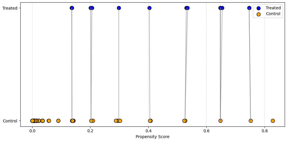
# Propensity matching visual
plt.figure(figsize=(10, 5))
plt.scatter(treated['propensity_score'], [1]*len(treated), c='blue', label='Treated', s=80, edgecolor='k')
plt.scatter(control['propensity_score'], [0]*len(control), c='orange', label='Control', s=80, edgecolor='k')
for i in treated.index:
plt.plot([treated.loc[i, 'propensity_score'], matched_control.loc[i, 'propensity_score']], [1, 0], 'gray', alpha=0.6)
plt.yticks([0, 1], ['Control', 'Treated'])
plt.xlabel('Propensity Score')
plt.legend(); plt.grid(axis='x', linestyle='--', alpha=0.5); plt.tight_layout(); plt.show()
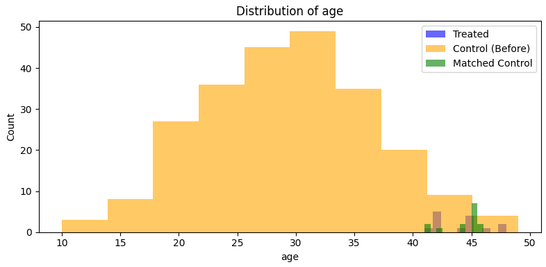
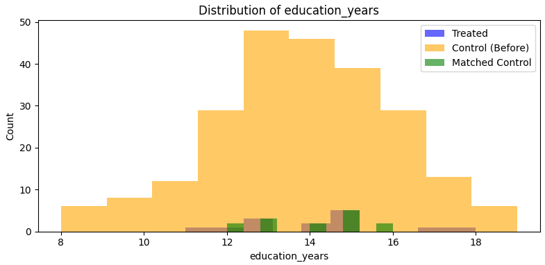
# Balance + distribution plots
print("Standardized Mean Differences (SMD):")
for var in covariates:
smd_before = smd(treated[var], control[var])
smd_after = smd(treated[var], matched_control[var])
print(f"{var.capitalize()}: Before = {smd_before:.3f}, After = {smd_after:.3f}")
plt.figure(figsize=(8, 4))
plt.hist(treated[var], bins=10, alpha=0.6, label='Treated', color='blue')
plt.hist(control[var], bins=10, alpha=0.6, label='Control (Before)', color='orange')
plt.hist(matched_control[var], bins=10, alpha=0.6, label='Matched Control', color='green')
plt.title(f'Distribution of {var}'); plt.xlabel(var); plt.ylabel('Count')
plt.legend(); plt.tight_layout(); plt.show()
# Estimate treatment effect
matched_df = pd.concat([treated, matched_control])
print(sm.OLS(matched_df['outcome'], sm.add_constant(matched_df['treatment'])).fit().summary())Visuals:
Output:
Standardized Mean Differences (SMD):
Age: Before = 2.661, After = -0.071
Education_years: Before = 0.237, After = 0.088

                           OLS Regression Results
==============================================================================
Dep. Variable:                outcome   R-squared:                       0.338
Model:                            OLS   Adj. R-squared:                  0.312
Method:                 Least Squares   F-statistic:                     13.27
Date:                Mon, 16 Jun 2025   Prob (F-statistic):            0.00118
Time:                        06:11:17   Log-Likelihood:                -83.109
No. Observations:                  28   AIC:                             170.2
Df Residuals:                      26   BIC:                             172.9
Df Model:                           1
Covariance Type:            nonrobust
==============================================================================
                 coef    std err          t      P>|t|      [0.025      0.975]
------------------------------------------------------------------------------
const         95.2021      1.306     72.910      0.000      92.518      97.886
treatment      6.7271      1.847      3.643      0.001       2.931      10.523
==============================================================================
Omnibus:                        0.729   Durbin-Watson:                   1.851
Prob(Omnibus):                  0.695   Jarque-Bera (JB):                0.697
Skew:                           0.029   Prob(JB):                        0.706
Kurtosis:                       2.229   Cond. No.                         2.62
==============================================================================
Key Takeaways from this example:
- The first chart shows how treated units are matched to nearest neighbor controls based on propensity score, with some controls reused (i.e. matching with replacement).
- The covariate balance improves after matching. We use Standard Mean Differences (SMDs) as a rule of thumb to assess balance: SMD < 0.1 is generally considered good, 0.1 – 0.2 suggests some imbalance, >0.2 may indicate problematic imbalance. Here, SMDs after matching are 0.07 for Age and 0.09 for Education, indicating good balance.
- The OLS regression estimates an ATT of 6.7 (p-value 0.00), which is both positive and statistically significant. The true effect coded in the simulation was 5, so the estimate is slightly high, likely due to added sampling noise and the small sample size.
Using IPW to estimate the ATE instead of Nearest Neighbors:
# Calculate IPW weights
df['weight'] = np.where(df['treatment'] == 1,
                        1 / df['propensity_score'],
                        1 / (1 - df['propensity_score']))

# Weighted least squares regression for ATE
model = sm.WLS(df['outcome'], sm.add_constant(df['treatment']), weights=df['weight']).fit()
print(model.summary())
Output:
                           WLS Regression Results
==============================================================================
Dep. Variable:                outcome   R-squared:                       0.281
Model:                            WLS   Adj. R-squared:                  0.278
Method:                 Least Squares   F-statistic:                     97.01
Date:                Mon, 16 Jun 2025   Prob (F-statistic):           1.57e-19
Time:                        06:41:27   Log-Likelihood:                -801.18
No. Observations:                 250   AIC:                             1606.
Df Residuals:                     248   BIC:                             1613.
Df Model:                           1
Covariance Type:            nonrobust
==============================================================================
                 coef    std err          t      P>|t|      [0.025      0.975]
------------------------------------------------------------------------------
const         89.7869      0.394    227.803      0.000      89.011      90.563
treatment     10.1960      1.035      9.849      0.000       8.157      12.235
==============================================================================
Omnibus:                        0.828   Durbin-Watson:                   2.033
Prob(Omnibus):                  0.661   Jarque-Bera (JB):                0.544
Skew:                          -0.048   Prob(JB):                        0.762
Kurtosis:                       3.207   Cond. No.                         2.91
==============================================================================
Interpretation:
- The IPW-weighted regression (WLS) estimates an ATE of 10.2 (p-value 0.00). This means if everyone attended a bootcamp, average outcomes would have been 10.2 higher. This is larger than the ATT of 6.7, which reflects the effect only among those who actually attended.
Instrumental Variables (IV)
What if we could find a proxy for randomization – something that nudges whether someone receives treatment, but isn’t directly tied to the outcome?
Imagine a customer support system that routes customers to either a live agent or a chatbot depending on the time of day or system load. This routing isn’t truly random, but it can act as an ‘instrument,’ an external factor that influences treatment assignment (chatbot vs. live agent) in a way that’s plausibly unrelated to the customer’s underlying need or satisfaction. For this to be a valid instrument, we have to assume that customers who reach out at different times of day aren’t different in some unobservable way that would affect their satisfaction.
This approach only works if some strong assumptions are met:
- The instrument must meaningfully affect treatment assignment (relevance).
- There must be no unobserved variables (confounders) that influence both the instrument and the outcome. In other words, the instrument must affect the outcome only through its effect on treatment (exclusion restriction).
In an IV setup, we use this kind of variation to estimate causal effects in two stages, called two-stage least squares (2SLS):
- First stage: using the instrument (e.g. system load or time of day) to predict treatment assignment.
- Second stage: Use the predicted treatment (from the first stage) to estimate its impact on outcomes.
By isolating only the variation in treatment that’s caused by the instrument, we try to strip away hidden confounding – such as customers self-selecting into live agent support because they are more upset or harder to satisfy.
Because these assumptions are hard to verify and often fragile in practice, IV methods are used less frequently in tech, unless a natural experiment presents a compelling case (e.g. staggered feature rollouts, system failures, or policy changes). Compared to other causal inference approaches like DiD or matching, IV relies more heavily on modeling assumptions and less on design-based identification.
Another important point is that IV methods only estimate what’s called a Local Average Treatment Effect (LATE). That is, the effect for the subset of people whose treatment status is actually influenced by the instrument. People who are not influenced by the instrument may have completely different treatment effects, so it’s not necessarily generalizable.
Suppose we want to measure the LATE of speaking with a live agent vs. a chatbot on customer satisfaction. We can’t just compare satisfaction scores, since more upset customers might seek out live agents, biasing the comparison. But let’s say that during peak hours, system load automatically routes more customers to chatbots. This creates a natural source of variation in treatment, which we can use as an instrument.
Code example:
import numpy as np, pandas as pd, statsmodels.api as sm
import matplotlib.pyplot as plt

# Simulate data
np.random.seed(0)
n = 200
df = pd.DataFrame({
    'time_of_day': np.random.choice([0, 1], size=n),  # instrument: 1 = peak hours
    'anger': np.random.normal(0, 1, size=n),          # unobserved confounder
})
# Treatment is influenced by time_of_day and anger
df['live_agent'] = ((-0.8 * df['time_of_day'] + 1.5 * df['anger'] + np.random.normal(0, 1, size=n)) > 0).astype(int)

# Outcome depends on true treatment effect and anger
df['satisfaction'] = 3 + 2.5 * df['live_agent'] - 1.2 * df['anger'] + np.random.normal(0, 1, size=n)

# First stage: predict treatment using instrument
Z = sm.add_constant(df[['time_of_day']])
first_stage = sm.OLS(df['live_agent'], Z).fit()
df['live_agent_hat'] = first_stage.predict(Z)

print(df.head(3))

# Second stage: predict outcome using predicted treatment
second_stage = sm.OLS(df['satisfaction'], sm.add_constant(df[['live_agent_hat']])).fit()
print(second_stage.summary())
Output:
  time_of_day     anger  live_agent  satisfaction  live_agent_hat
0            0 -1.165150           0      5.169586        0.525253
1            1  0.900826           1      5.448447        0.316832
2            1  0.465662           0      1.532442        0.316832
                            OLS Regression Results
==============================================================================
Dep. Variable:           satisfaction   R-squared:                       0.032
Model:                            OLS   Adj. R-squared:                  0.027
Method:                 Least Squares   F-statistic:                     6.454
Date:                Mon, 16 Jun 2025   Prob (F-statistic):             0.0118
Time:                        05:34:57   Log-Likelihood:                -355.92
No. Observations:                 200   AIC:                             715.8
Df Residuals:                     198   BIC:                             722.4
Df Model:                           1
Covariance Type:            nonrobust
==================================================================================
                     coef    std err          t      P>|t|      [0.025      0.975]
----------------------------------------------------------------------------------
const              2.8231      0.423      6.669      0.000       1.988       3.658
live_agent_hat     2.4851      0.978      2.541      0.012       0.556       4.414
==============================================================================
Omnibus:                        2.137   Durbin-Watson:                   2.160
Prob(Omnibus):                  0.344   Jarque-Bera (JB):                2.019
Skew:                          -0.246   Prob(JB):                        0.364
Kurtosis:                       2.982   Cond. No.                         11.3
==============================================================================
Key takeaways from this example:
- Two-stage least squares (2SLS): First, we used time of day to predict whether someone spoke with a live agent (treatment). Then, we used that predicted treatment to estimate its effect on satisfaction.
- The IV estimate of the treatment effect (2.49) is very close to the true effect (2.5), despite the model never seeing the confounding variable (anger).
- IV identifies only the local average treatment effect (LATE), i.e. the effect for customers whose treatment status was influenced by the instrument, and not the effect for everyone. And this estimate is only valid under the assumptions that the instrument must be relevant and satisfy the exclusion restriction.
Note: For accurate inference, we’d typically use a dedicated 2SLS package to correct standard errors across both stages.
Regression Discontinuity Design (RDD)
RDD is often considered a special case of IV, where the instrument is a known cutoff in a continuous running variable. Suppose we want to measure the impact of a bank’s credit policy – specifically, whether getting approved for a loan affects a customer’s future credit score. We can’t randomly approve or deny people across a range of credit scores, but we can take advantage of a natural cutoff. Here our ‘treatment’ is loan approval, and our ‘instrument’ is whether or not a customer is above the credit score threshold. The main assumption here is that a customer cannot manipulate their running variable (i.e. they cannot tweak their credit score to move from 590 to 600 to meet the threshold). This assumption can be checked by testing for a discontinuity in the density of the running variable near the threshold, for example using the McCrary Density Test.
If the bank uses a credit score threshold, say 600, then people just above and people just below the threshold are likely very similar on all other characteristics, meaning that any difference in their outcomes (future credit score) are likely due to the treatment (loan approval). That’s the intuition behind the ‘discontinuity’: a sharp jump in treatment assignment at a known threshold. A similar setup appears in this blog post on subscription pricing decisions here.
Note: RDD is not generalizable to the full population (i.e. it is only meaningful for the subset near the threshold).
Code example:
import numpy as np, pandas as pd, matplotlib.pyplot as plt
import statsmodels.formula.api as smf

# Simulate dataset
np.random.seed(0)
x = np.linspace(580, 620, 30)  # 30 credit scores evenly spread
t = (x >= 600).astype(int)     # treatment: approved if score >= 600
y = 0.25 * x + 10 * t + np.random.normal(0, 3, size=len(x))
df = pd.DataFrame({'x': x, 't': t, 'x_c': x - 600, 'y': y})

# Plot
plt.scatter(x, y, c=t, cmap='bwr', s=50, alpha=0.8)
plt.axvline(600, color='k', linestyle='--')
plt.xlabel('Initial Credit Score')
plt.ylabel('Future Credit Score')
plt.show()

# RDD regression
result = smf.ols('y ~ x_c + t', data=df).fit()
print(result.summary())
Plot:

Output:
                           OLS Regression Results
==============================================================================
Dep. Variable:                      y   R-squared:                       0.830
Model:                            OLS   Adj. R-squared:                  0.818
Method:                 Least Squares   F-statistic:                     66.08
Date:                Sun, 15 Jun 2025   Prob (F-statistic):           3.97e-11
Time:                        21:56:41   Log-Likelihood:                -77.082
No. Observations:                  30   AIC:                             160.2
Df Residuals:                      27   BIC:                             164.4
Df Model:                           2
Covariance Type:            nonrobust
==============================================================================
                 coef    std err          t      P>|t|      [0.025      0.975]
------------------------------------------------------------------------------
Intercept    151.8624      1.362    111.537      0.000     149.069     154.656
x_c            0.2308      0.102      2.262      0.032       0.021       0.440
t              8.9324      2.436      3.666      0.001       3.933      13.931
==============================================================================
Omnibus:                        1.039   Durbin-Watson:                   2.101
Prob(Omnibus):                  0.595   Jarque-Bera (JB):                0.486
Skew:                          -0.309   Prob(JB):                        0.784
Kurtosis:                       3.091   Cond. No.                         53.8
==============================================================================
Key takeaways from this example:
- We’re running a regression on both the distance from the cutoff (x_c) and the treatment indicator (t), which captures the jump at the threshold.
- This relies on a key assumption about bandwidth: are we using all observations, or just those within a window around the cutoff? A smaller window reduces bias (by making treated and control groups more similar) but increases variance (due to fewer observations) in our estimate – i.e. the bias/variance tradeoff. Even if we use the full dataset, we might want to downweight observations further from the threshold.
- The coefficient on x_c (0.23, p-value 0.03) estimates the slope of the relationship between initial and future credit scores near the threshold. The true value is 0.25, so this is quite close.
- The coefficient on t (8.93, p-value 0.00) estimates the treatment effect: getting a loan increases future credit score by about 9 points, close to the true simulated effect of 10.
- The visible jump between the red (treated) and blue (control) points around the 600 score show how RDD can estimate causal effects without full randomization, so long as the cutoff is sharp and other assumptions hold.
Conclusion
Causal inference is a deep and nuanced field, on par with statistics or computer science in its breadth. While I’ve covered some commonly used methods – like DiD, ITS, PSM, IV, and RDD – many more exist, and they’re often combined in practice.
The goal is always the same: to estimate causal effects as accurately as possible, especially when randomized controlled experiments aren’t feasible. With careful design and skepticism about bias, we can often get surprisingly close to the truth – even in complex, observational settings.
There’s a rich body of applied research in policy analysis, economics, and tech that continues to push the field forward. Newer techniques like Double Machine Learning (DML) are gaining traction, especially in high-dimensional settings. Still, every method relies on assumptions, and the best practitioners are those who understand when those assumptions are reasonable, and when they are not.
A well-designed A/B test remains the gold standard. But when that’s not possible, causal inference gives us a toolkit to approximate that rigor thoughtfully, transparently, and responsibly. It can also help identify areas promising enough to justify the cost and effort of a future A/B test.
In practice, the biggest challenges aren’t just technical – they’re about understanding the product, data, and incentives of the system we’re studying. The more you know about the real-world context, the better your causal estimates will be.
At its heart, causal inference is about curiosity and discipline. It’s a way of asking, “What really made the difference?” and having the tools to get a defensible answer.
Appendix
Directed Acyclic Graphs (DAG)
DAGs are another causal inference framework (compared to the potential outcomes framework). DAGs clarify our assumptions and reveal confounders (variables we need to adjust for), colliders (which can introduce false associations), and mediators (intermediate steps between treatment and outcome). Creating one forces you to think carefully about causality. This can get deceptively complex, so I’m not going into detail here, but even if we don’t explicitly draw a DAG, we are effectively making assumptions that could be illustrated with one.
The directed part tells you that the edges have a direction, as opposed to undirected graphs, like a social network, for example. The acyclic part tells you that the graph has no loops or cycles. Causal graphs are usually directed and acyclic because causality is nonreversible…. This language of graphical models will help you clarify your thinking about causality, as it makes your beliefs about how the world works explicit.
– Matheus Facure (Causal Inference in Python)

Geo & Switchback experiments
I moved this section to the appendix since we are focusing on what to do when we cannot experiment, but clustering type experiments are often covered outside of RCTs.
Geo Experiments
A geo experiment is similar to an A/B test, but instead of randomizing at the user level, it uses different locations (geographies) to form treatment and control groups. This helps avoid contamination – for example, if we’re testing the impact of billboards, we can’t randomize who sees them, but we can randomize which cities get the billboard campaign.
We can compare average outcomes before and after exposure across groups or run a regression that adjusts for city-level covariates (e.g. population, baseline sales) to better isolate the effect (similar in spirit to the CUPED approach for variance reduction). Geo experiments can be analyzed using a DiD or ITS, depending on the setup and presence of a control.
The validity of a geo experiment depends heavily on:
- Whether the selected locations are comparable (e.g. similar in pre-treatment metrics like sales or traffic).
- Whether each geo has sufficient sample size to detect meaningful effects (which can often be evaluated via power analysis or simulation).
Switchback Experiments
A switchback experiment is a time-based alternative where we alternate the treatment on and off over time (e.g. pricing or feature toggles by day or hour). This is useful when randomizing by user isn’t feasible – such as testing pricing where users may share screenshots.
For example, we might apply a new pricing strategy on even days and revert to the old one on odd days. This introduces multiple interruptions into the time series, creating a design similar to ITS, but with repeat switches.
Key things to get right:
- Ensure the switching pattern is randomized or pre-specified (not reactive).
- Keep consistent exposure windows (e.g. apply treatment for full days).
Here is a simple code example:
import pandas as pd, numpy as np, statsmodels.formula.api as smf

np.random.seed(0)

# Simulated switchback: 8 days, alternating treatment
data = pd.DataFrame({
    'day': range(8),
    'treatment': [0, 1, 0, 1, 0, 1, 0, 1]
})
# Base sales + small treatment effect + noise
data['sales'] = 100 + 5 * data['treatment'] + np.random.normal(0, 2, size=8)

model = smf.ols('sales ~ treatment', data=data).fit()
print(model.summary())
Output:
                           OLS Regression Results
==============================================================================
Dep. Variable:                  sales   R-squared:                       0.412
Model:                            OLS   Adj. R-squared:                  0.314
Method:                 Least Squares   F-statistic:                     4.205
Date:                Sun, 15 Jun 2025   Prob (F-statistic):             0.0862
Time:                        21:54:13   Log-Likelihood:                -15.953
No. Observations:                   8   AIC:                             35.91
Df Residuals:                       6   BIC:                             36.06
Df Model:                           1
Covariance Type:            nonrobust
==============================================================================
                 coef    std err          t      P>|t|      [0.025      0.975]
------------------------------------------------------------------------------
Intercept    102.7802      1.026    100.156      0.000     100.269     105.291
treatment      2.9760      1.451      2.051      0.086      -0.575       6.527
==============================================================================
Omnibus:                        2.659   Durbin-Watson:                   1.837
Prob(Omnibus):                  0.265   Jarque-Bera (JB):                0.627
Skew:                           0.682   Prob(JB):                        0.731
Kurtosis:                       3.132   Cond. No.                         2.62
==============================================================================
Key Takeaways from this example:
- The simulated experiment alternates treatment every other day (for the full day).
- The regression estimates the intercept (102.8) and treatment effect (2.98) close to the true values used in data generation (100, 5 respectively).
- Due to the small sample size, the estimated treatment effect has a wide confidence interval and higher p-value (0.09).
Resources
- Causal Inference in Python by Matheus Facure
- Matheus Facure also wrote Causal Inference for The Brave and True
- Mastering Metrics by Joshua D. Angrist, Jörn-Steffen Pischke (also Mostly Harmless Econometrics)
- There are many good blog posts out there (e.g. Uber, Doordash)
Thanks for the review Jon Schellenberg, Nick Topousis, and Mike Ash!
